

Me? I’ve had so much trouble with internet connection lately. Ugh.. It’s like I’ve been in the middle of cave in the mountain nowhere -,-“
Ehm! Back to the topic. I’ve brought some news for y’all. First one, we’ve got the title for [anuStar]. We’ve named it, Stellar Arms. *SFX: clapping hands*
Why "Stellar Arms"?
We’ve done voting to choose the title (literally).
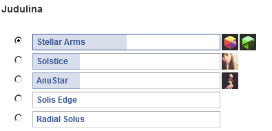
There was 5 choices and we’re getting narcissists enough to choose the-one-with-‘stellar’ in the title *LOL-ing*. And the ‘arms’? I don’t think another part of our body can do better than “arms”. Stellar Head? Stellar Belly? Stellar Armpits? Errrgghh.. Should I stop now?
Long comments directly from Lazcht:
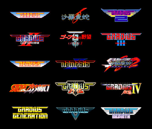
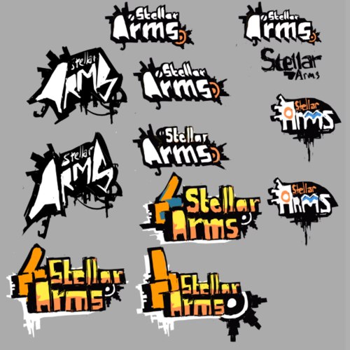
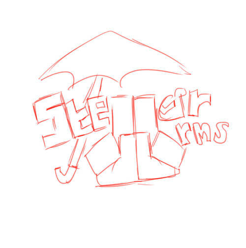
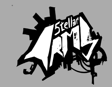
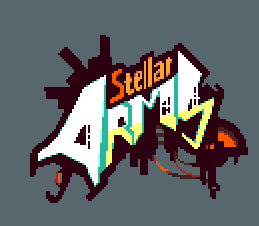
We had weeks to gather title candidates to replace [anuStar] codename. I myself had to think about the universe and background story for this, then look for a suitable, memorable words and unique enough for this project.I was thinking Sol’s weapon name, or something related to fire and water/ sun and rain, radius, umbrella, weapon, or name of the place the game sets on. I proposed some latin names like Solis (latin for sun) which hipondisliked because it sounded like chemical things haha. My favorite idea was Solis Arms. Arms stands for the term for umbrella-weapon Sol’s using.Clea said “Whichever the name we choose in the end, it wouldn’t be as good as anuStar.” So actually he didn’t really gives a fuck, but he has good point.Hipon proposed Sword & Scattergun, Solis Edge, Weapons of Umbra. Solis Edge was quite interesting, but sounds too close to Soul Edge, haha.While Reijubv proposed some words translated in different languages, coolest one is Exilio something. But then again it’s sounds too “foreign”.At last day we decided to make the title fix, we brainstormed once more, and get Stellar Arms.Then moving on to logo. This was hardest game logo i have made so far, hipon was asking for a logo which focus on typography and he gave me references like these:I personally don’t like a symmetrical or bended/stretched both sides likeGradius. I have posted this previously though, you can see all of my attempts on this:and above was an idea sketch from Reijubv. he cleverly used the two fingers and a thumb for L and A, lol, but unfortunately it lacked “action” and seriousness i want to project.Hipon kept on saying it was okay but didn’t quite like it and didn’t play with typography much, almost frustated, he then said, "Well maybe the references i gave was not your style after all, so do what you think is good."Then i came up with the last logo, then i pixelled it out (why? because i want this project full of pixel!) and gave it little bit of colorful touch.concepts i want to maintain was: fingers (for goey fingers), umbrella and jellyfish. I want them to look kind of sporty, simple, futuristic and funky. I’m now quite satisfied with the result! :Dnow go back to Chel, i got enough space hijacking on this devlog.
Okei, at last but not least, we would say thanks to Cem, Aditya Sumantri, and Rendi Kristyadi for the fan arts. We’re quiet surprised with all of the fan arts. We love you, bros! :D
That’s all for today. Thank you for reading and the supports! And for the hijack-post by Laz ;)